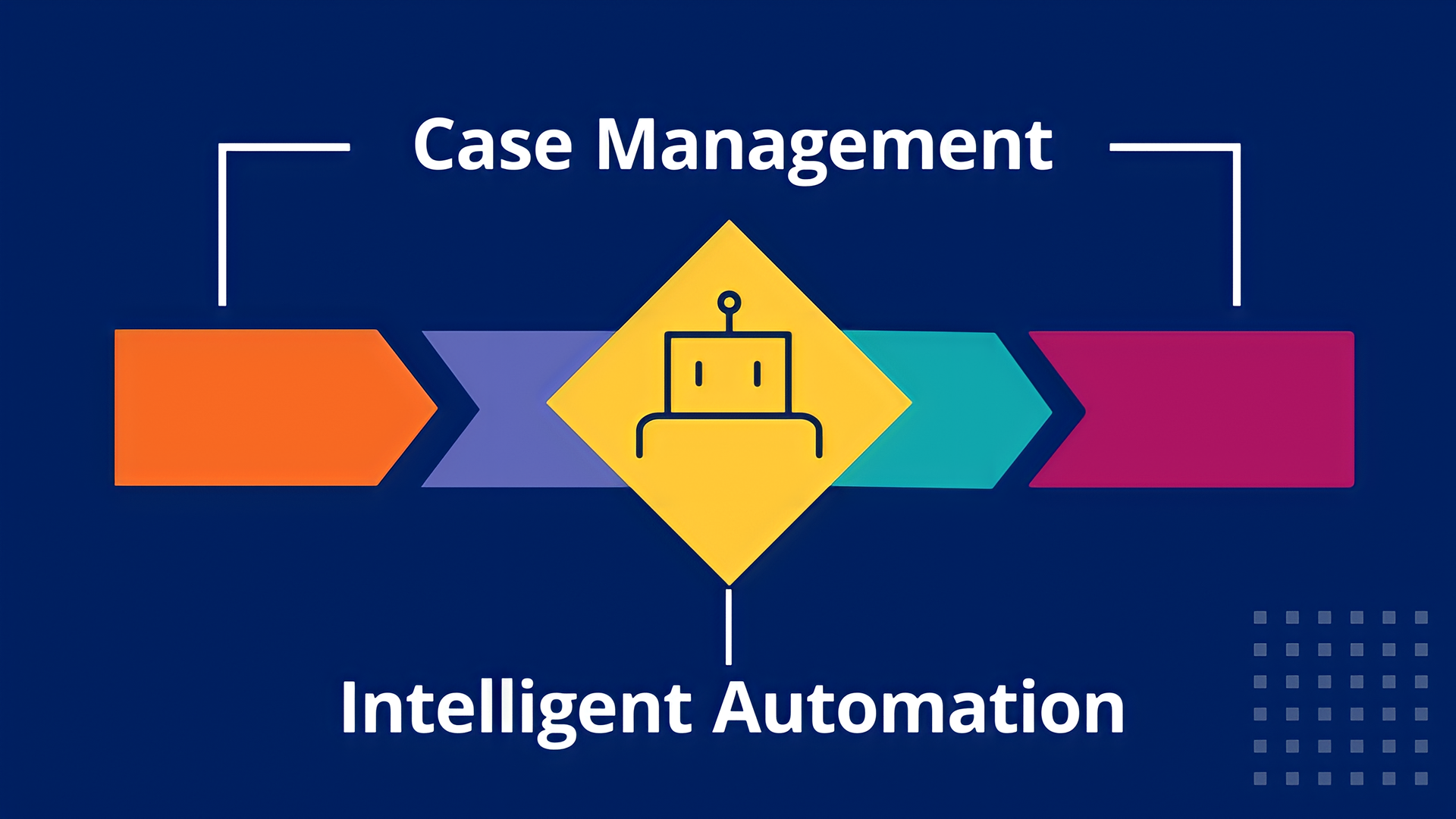
aBOUT the Product
Pega's low-code platform and feature-rich case management software use AI powered recommendations to help automate and improve customer service experiences for businesses and their end users by reducing both servicing and development time.
I worked closely with sales engineers and POs across various product lines to identify common concerns our prospective customers voiced during sales demos. My role was to design new screens and flows for SDK demos that would mitigate common concerns and improve understanding of how our products might fit within our customer's own platforms.
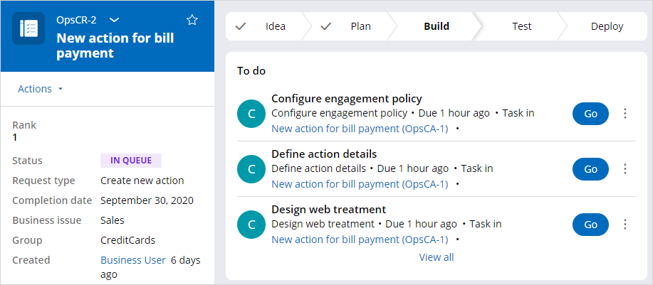
Example of Pega's case management platform using Pega COSMOS design system
Case Study: Implementing Flexible UI in the Pega Platform
When I joined the company, Pega had recently adopted a new model for out of the box features in its case management system. The old model allowed users to customize every aspect of the product, including the UI.
Unfortunately, the high level of customization sometimes made it difficult for Pega's support teams to assist customers experiencing issues with their applications because many of said applications had evolved beyond the support team's knowledge. As a result, the company decided to roll back some of the available customization options shortly before I joined.
The Problem
After removing many of the old customization features, customers started to worry that they would not be able to implement their own branding or UI. This quickly became one of the largest concerns for new customers looking to adopt the platform.
While sales teams did their best to assure new customers that this was not the case, there was very little information in the existing customer demos or out of the box product to prove otherwise.
The Solution
I worked with a small team that included a product owner, a UI developer, and another UX designer who provided occasional feedback to design a new demo that would show potential customers all the key features that the Pega platform offers while highlighting the ability to implement a design system of choice.
The goals for the project included:
1. Design a workflow that touches on all the core features in the case management system (i.e. viewing and managing accounts, tracking progress of a case, messaging support in real time, etc.,)
2. Reduce the amount of clicks and scrolling required to present a full demo
3. Translate Pega's case management UI into another design system
The Process
Since Pega products support people and businesses in a variety of industries, it was important to choose an industry that was simple enough to mitigate the need for explanation during sales demos yet complex enough that it could showcase a wide array of features without feeling forced.
Telecom was a perfect fit for our demo apps and websites because it is an industry that provides both consumer products and online services at an enterprise and individual level. This model allowed us to build out one demo application that could handle all kinds of use cases. We designed flows ranging from purchasing an individual phone plan to managing multiple mobile lines all the way through tracking service vehicles on their way to provide home installation for wifi.
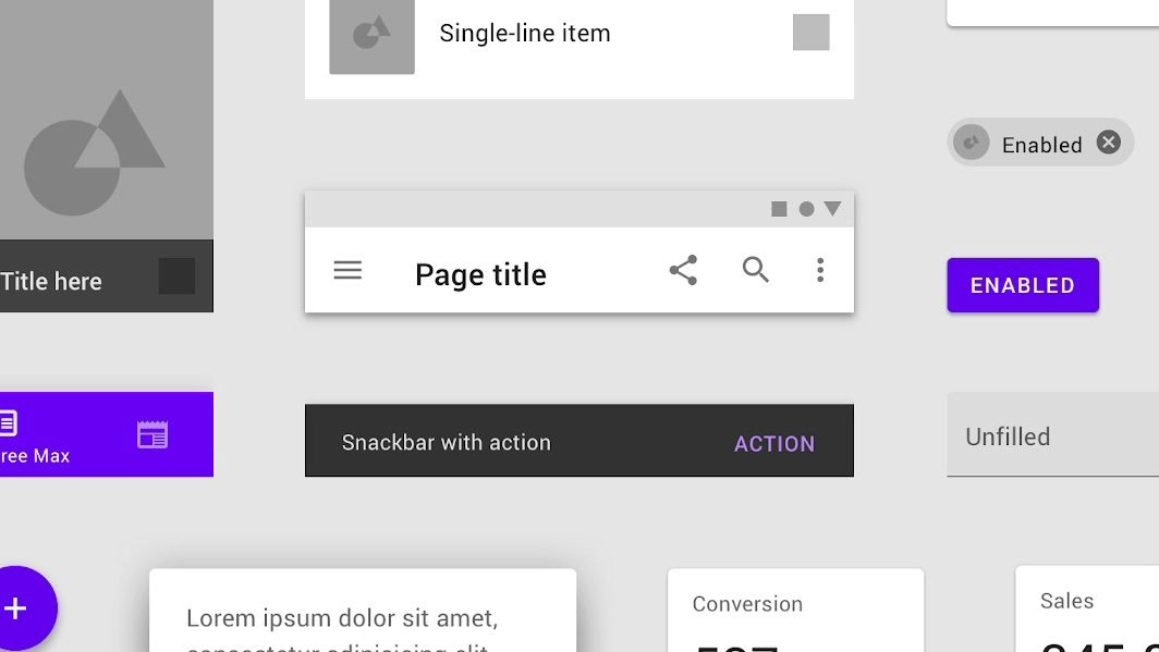
Google Material design system graphic
In order to address concerns about UI customization, I chose to create the entire demo application using Google Material – a design system used in more places than you think – and a custom color palette. In doing so, I hoped to show customers that Pega's technology could look however they wanted it to.
After settling on an industry and visual direction for our demo application, we started thinking about what screens we would need to build and how the flow should look to demonstrate the platform's benefits to our customers.
I started this process by assessing the existing customer demos and discussing my findings with my team. The first thing I noticed was the lack of realism and consistency in the demos. The demos were old, the use cases didn't all make sense, and it was clear that each screen was created by a different developer who each had a different industry and target user in mind when building their respective pages. These issues were easily addressed through the nature of the redesign.
The larger issue was that the existing demos followed a highly constrained workflow where the user could only accomplish a portion of their task one page at a time. This type of flow was a direct translation of the older Pega case management system, which was designed with fewer industries in mind. While the constrained stages and steps work well for users who perform a singular role in an ongoing process, the platform has since evolved to include additional functionality that now supports individuals performing a singular task from start to finish.
Early workflow using Pega's case lifecycle model with constrained steps for each task
In order to improve the demo experience, I wanted to create a flow that felt more exploratory, similar to the workflows we typically see when browsing an ecommerce website or ordering food online. I still wanted to leave room for the page by page flow but chose to use it only in the part of the demo where we showed customers how they can manage logistics such as tracking packages or monitoring service vehicles using the Pega platform.
In my initial designs, I experimented with one and two column layouts and removed any features that wouldn't align with our demo scenarios such as the side navigation with a call timer and customer tabs, which are all designed to help customer service reps manage their calls with customers.
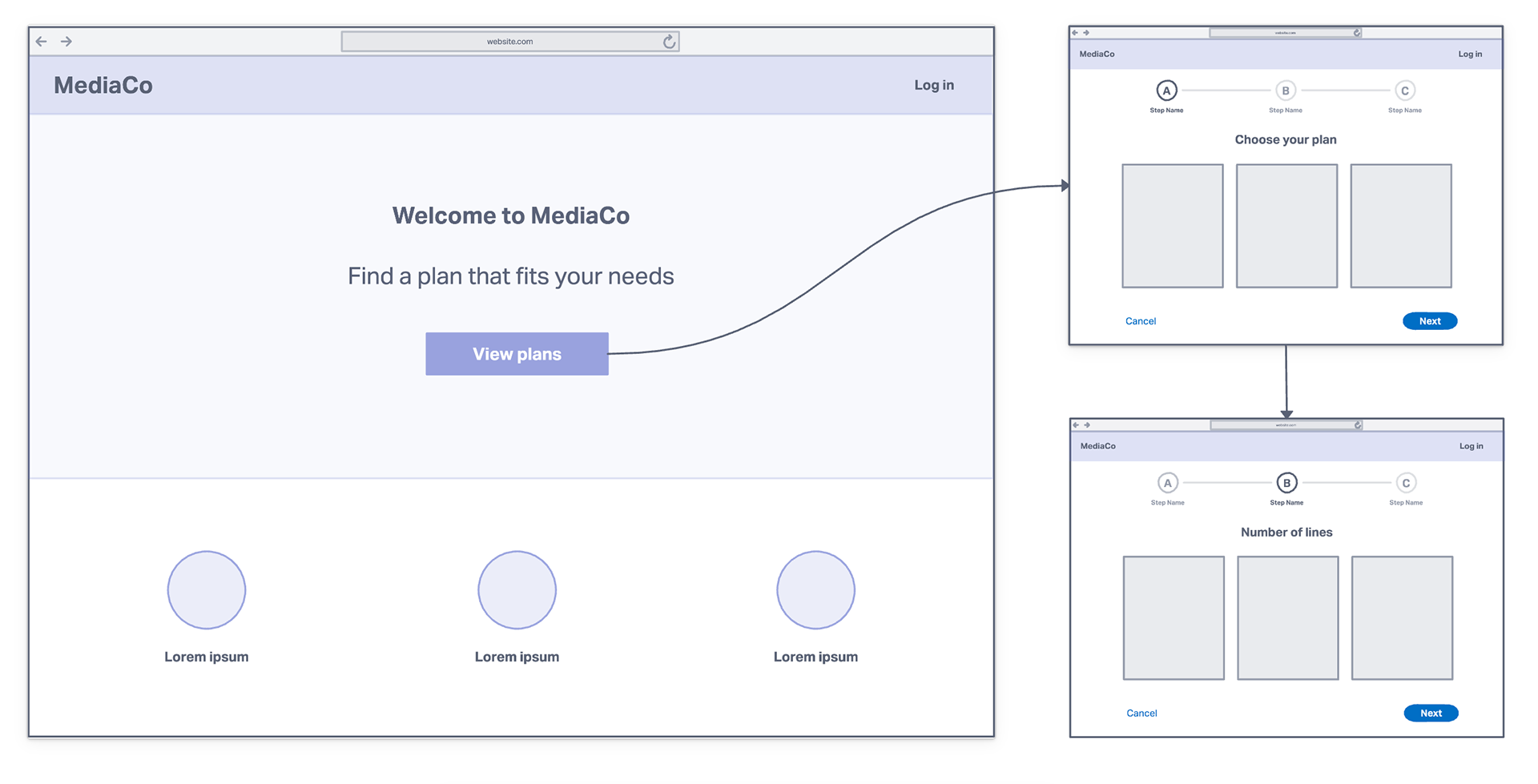
I put the remaining features into my layouts and started building out the flow for our first demo scenario of purchasing a phone plan from our fictional telecom company, MediaCo. With fewer features to tackle, I was able to transform Pega's feature-rich management platform into a simple website.
To reduce clicks and scrolling during demos, I moved the phone plan options that were originally split into three screens into a card layout on the landing page so that sales reps could simply launch the demo, click a card on the landing page, and go straight to the case management process that we ultimately wanted to showcase.
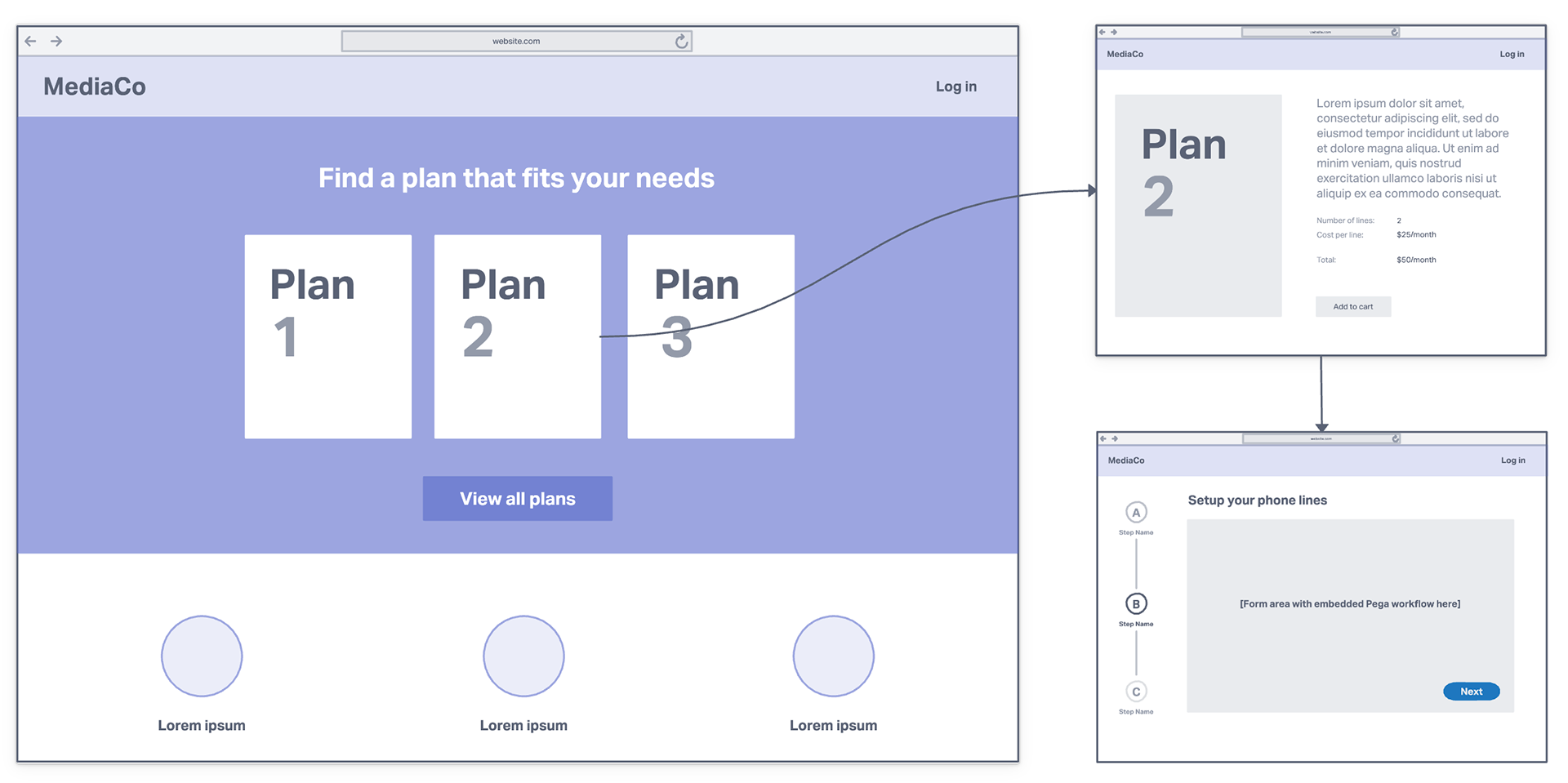
Example of new workflow for demo
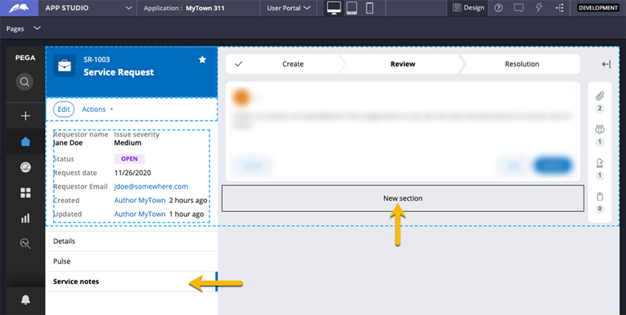
While translating Pega's case management features into Google Material for our fictional telecom company, I took the opportunity to incorporate some of the feedback that came up in a separate usability test. Our researchers discovered that users were struggling to understand where their notes were going after typing them into a "details" section of a form. The image below shows an example of where the details section for notes would go on the case management screen (arrow pointing to "New section") and where they end up once the user submits their notes (arrow pointing to "Service notes").
Creating a case management app with Pega's low-code platform
While this is a standard behavior in all of Pega's case management platforms, it was something that product teams were already considering removing due to similar confusion both from end users and internal folks. I learned that the placement of the notes tab and the space where the notes are entered are not subject to technical constraints but rather ended up where they did because it was space efficient at the time.
For our telecom demos, I opted to move all the tabs from the left hand side to a horizontal tab bar that sat just below the area where the user would enter the information and right above the area where the notes would appear in a read only format.
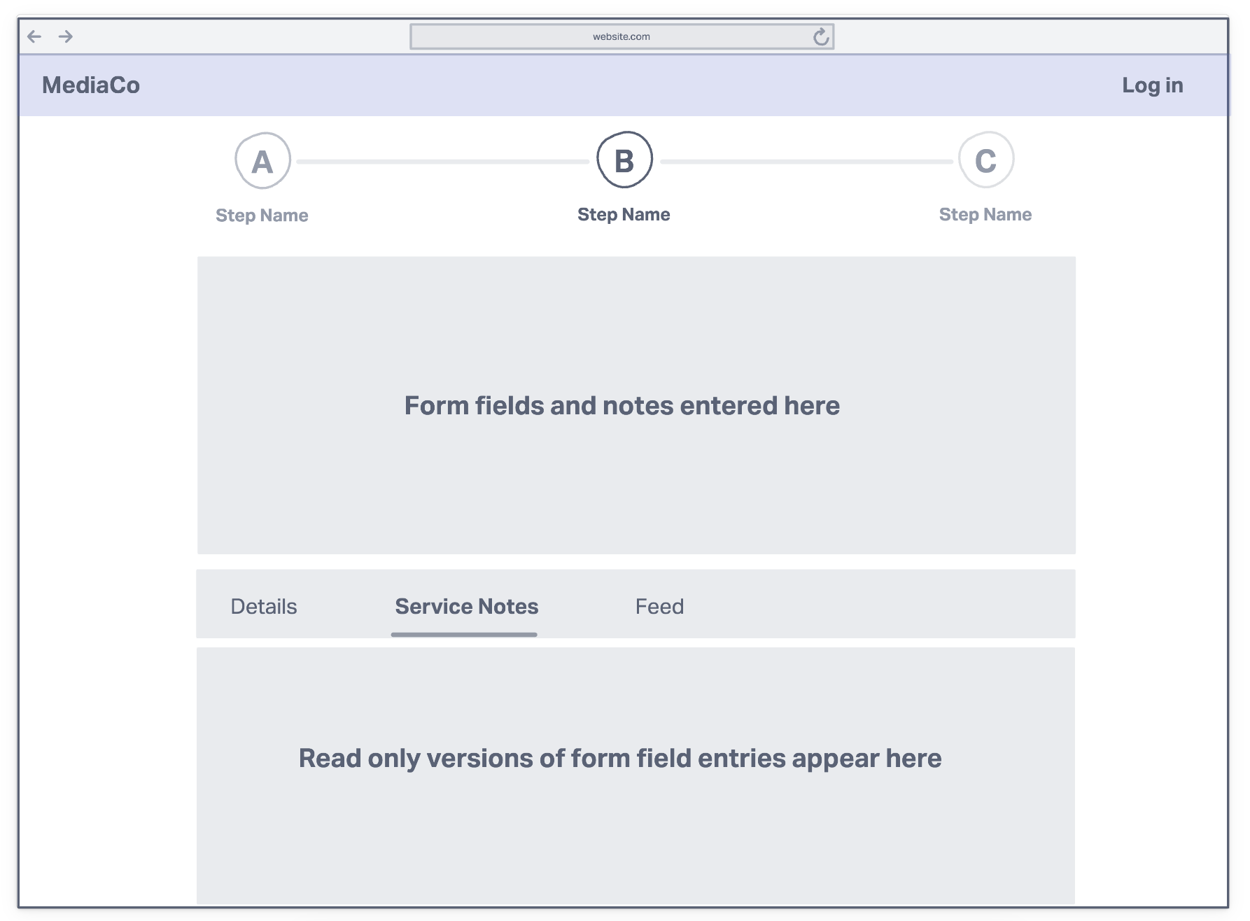
Example of a one column case management screen
The one column layout pictured above was the result of many conversations in which we decided we could remove more features from the demo screens. Throughout the project it became clear that the biggest priority for our stakeholders was to show that the Pega platform can be embedded in an existing site or stand alone with a custom UI on top (or a little bit of both).
A few iterations later, we were able to get to a place where we all felt that we had accomplished our goals. I shared the "finished" designs with our stakeholders and a few other members of the End User Experience team then incorporated the remaining pieces of feedback into what would be the final design for the new customer demos.
The Outcome
The web demo I designed is planned for release, with the addition of a mobile version, in fall/winter 2022. Additionally, some of the discussions held during the project led to new ideas that could serve useful in other parts of the company. One of these ideas was a card stack widget that I designed when trying to find a new way to display the user's most recent case activity. The card stack was meant to replace an existing table that took up significant screen real estate and didn't serve its purpose as a quick lookup due to the density of text based information within each row.
Overall, the project was a great way for me to explore new ways of handling existing features and functionality and an equally great way to familiarize myself with a new design system. I got to spend a lot more time engaging in UX as it relates to business strategy and had the opportunity to share my design process and ideas with new people.